Component Marketplace
OverviewThis project will allow makers to purchase third-party-developed components.
It is part of a greater effort that will give users the opportunity to get their hands on some awesome components and external devs to make money.
RoleProduct Designer
Interaction, Visual Design, Prototyping & Testing
November 2021 - March 2022
Adalo is a no-code platform that allows makers to design, build, and ship apps without any coding knowledge. Users can use a wide arsenal of drag and drop components, to design and publish beautiful, useful and powerful apps for their businesses, sturtups or side projects.
Project Scope
Component Marketplace was launched to help third-party devs sell components to our makers on Adalo, and it needed a redesign.
Project Goals:
Have a full, public release of the Marketplace with Premium Components with at least 20 new libraries for makers to purchase.
Have a way to protect paid components from being copied or shared without payment.
Allow devs to be self-sufficient with onboarding, payouts, and library data updates.
Known Problems:
The current Marketplace modal doesn’t have a way to categorize the components
Component cards don’t have enough information for prompting makers to spend money on it
The Design
Released Feature Walkthrough video ⬆️
High-Fidelity Designs Breakdown
The Component Marketplace 2.0 view ⬇️
Individual Component Details Page ⬇️
Validating the designs
We conducted usability testing sessions with our experts and makers who signed up for our research program to validate whether the new designs solved the problems and are easy to understand.
Feedback was positive and during observation, we noticed good interaction with the mockups.
Results and takeaways
Marketplace 2.0 lunch was successful. We sold over $3,600 in components, which means devs making a significant amount! Makers purchased over 160 components
Some key takeaways from this project are:
The project scope can change. Product vision can shift because of many factors and the scope of the project that is in progress can be cut, so always be prepped to PIVOT! (in Ross's voice)
The Process
MoSCoW Method
The product team along with Engineers and QA had a workshop to determine our Maker facing features with the help of MoSCoW method.
We identified the following:
User Flow
The team made a maker flow to help us see how many steps were needed to get through the flow successfully.
Designs
Sketches
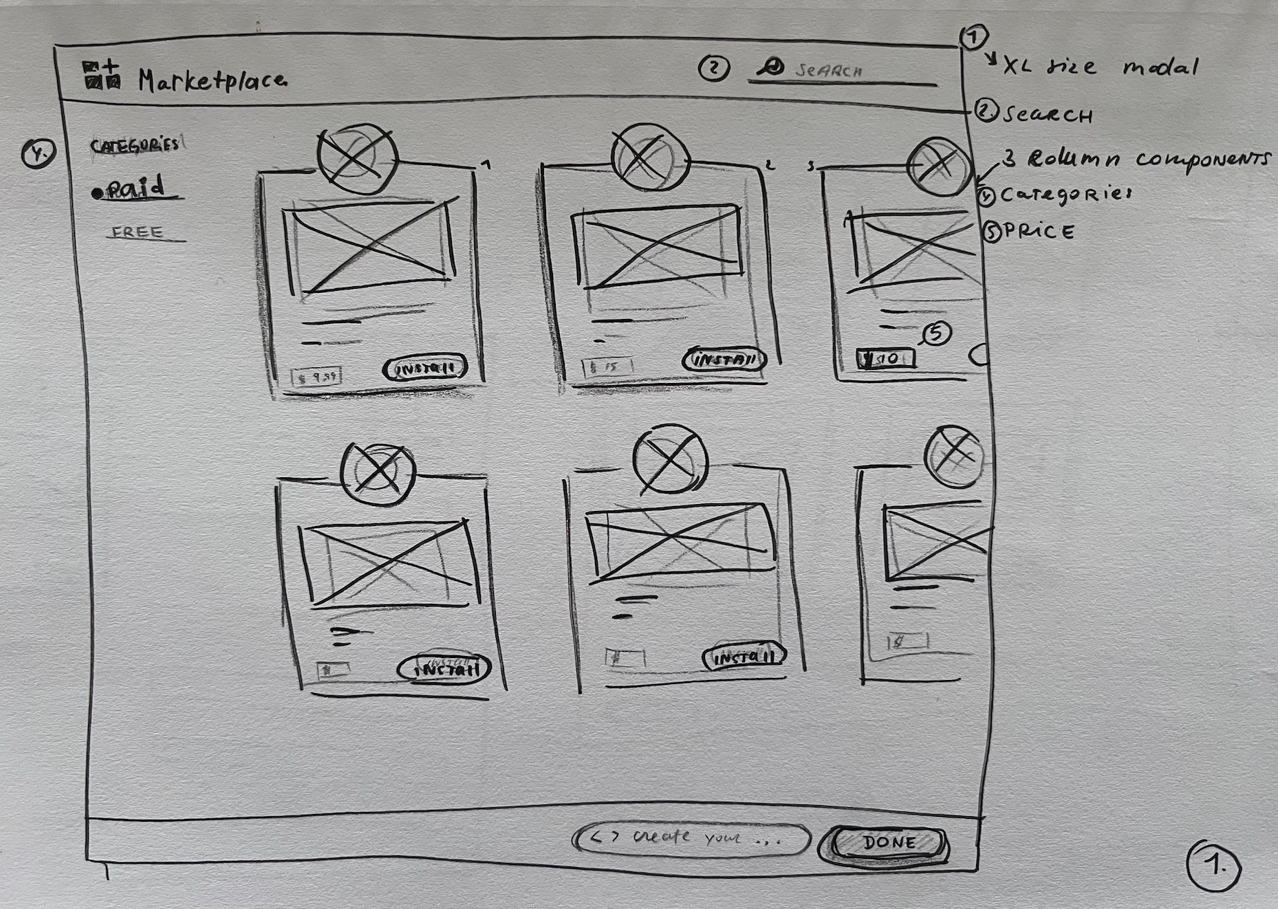
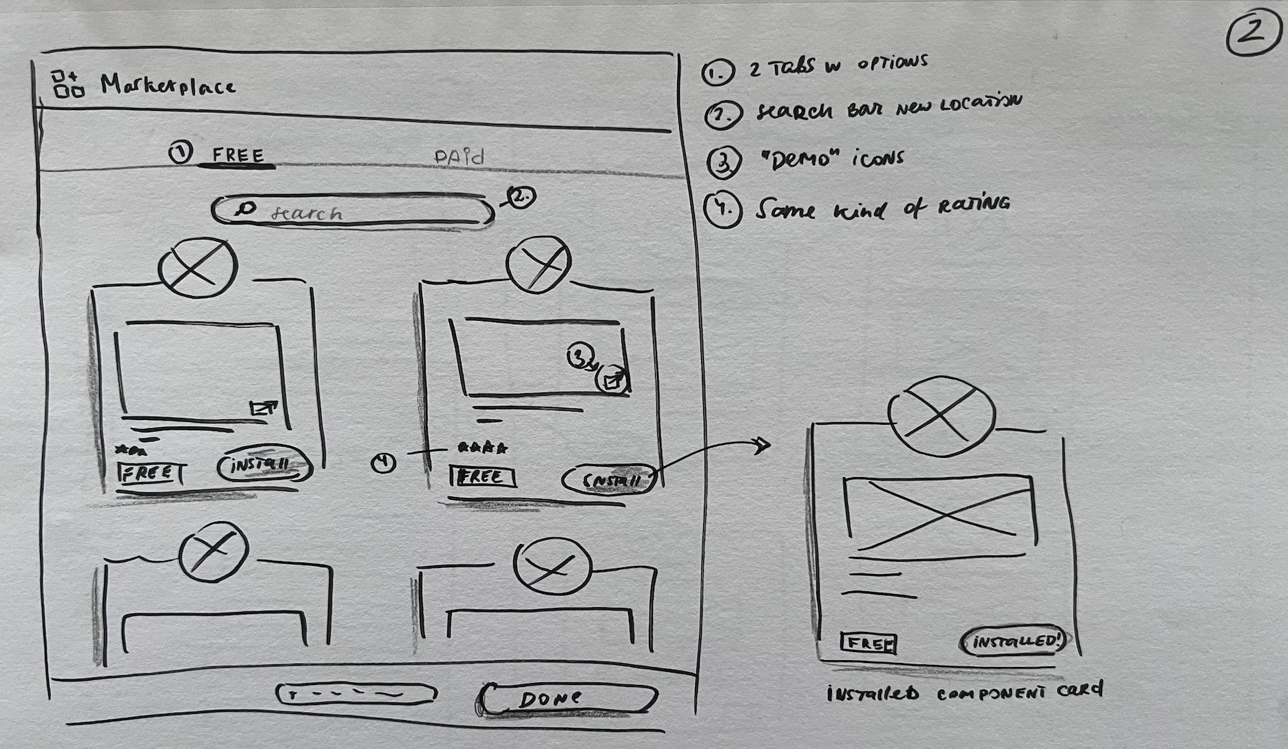
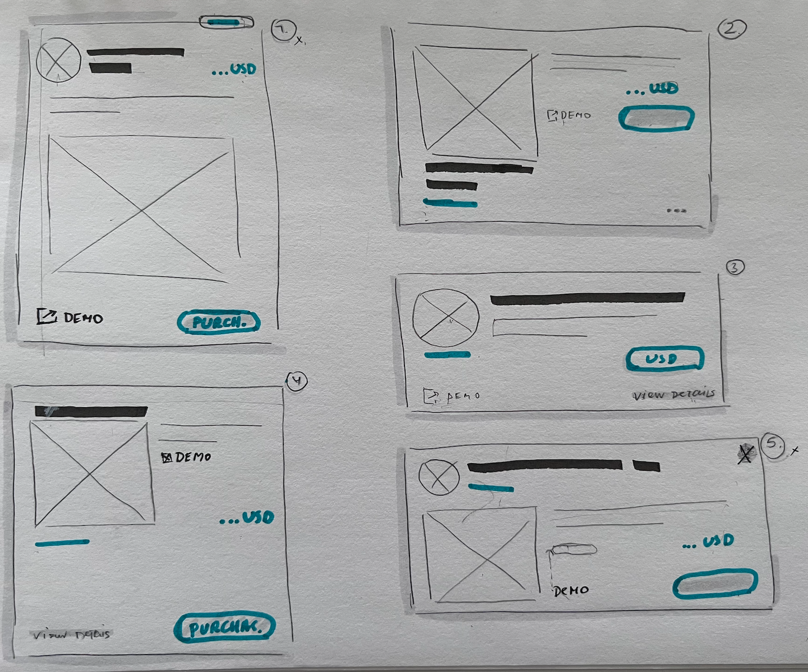
Based on the above problems, feature prioritization, and project requirements I started sketching to find the best possible solution
Redesigning current component listing cards
Adding details page with new information and functionality
Adding sorting options to listing modal
I quickly sketched out some basic wireframes to gather feedback from Product, Engineering, and QA. I wanted to test the initial ideas and ensure that designs can be implemented within the given timeframe.
Feedback from the team identified that the overall flow was in a good place, but individual component listing card designs got many different suggestions and went in many different directions that I had to iterate on the designs


High-Fidelity
With the overall design feedback being positive, I decided to move into High-Fidelity mockups
Marketplace Modal V1
The new Marketplace listing modal design was improved by making the modal real estate bigger so it could fit more components, adding a side panel with filtering options, and removing a CTA button because it was not proving to be beneficial.
Old design ☝️
New Iteration ☝️
Component Details Page V1
With the old Marketplace designs, there was no details page shown, so this feature was completely new in design and functionality such as name, price, demo link, and who it was made by.
Component details page iteration ☝️
Post Feedback Changes
After full company feedback and checking with stakeholders there were some design changes
Marketplace Modal - Final
The final Marketplace listing modal design was improved by making the component listing cards smaller so that makers could scan through faster. Different states for the CTAs to communicate information quickly to makers (i.e. purchased), along with price chips for paid components, and calling out free components also helped with the readability of the information.
Final Design ☝️
Component Details Page - Final
The component details page was improved by making the purchase button sticky so it doesn't disappear while the maker is scrolling through the information, having a smaller banner area to fit more important text to scan through, right info panel to have quantitative data separated.
Final Component details page ☝️


